
Ok, I don’t need a logo. But it would be fun to have one. Especially if I want to take these product experiments as close to real products as possible.
I’ve decided to collect these experiments under the name analog. This name makes sense to me, coming from a software engineering background and now delving into designing physical products. I want to create a logo that is simple, recognizable and that evokes the right feeling. Since the products are often a mix of retro 80s and 90s design and tech with their modern counterparts, the logo should convey this mix of old and new.
I started with some simple ideas in a free vector graphics drawing program called Inkscape. Not being used to drawing vector graphics or logo design, I started with a grid to help me along.
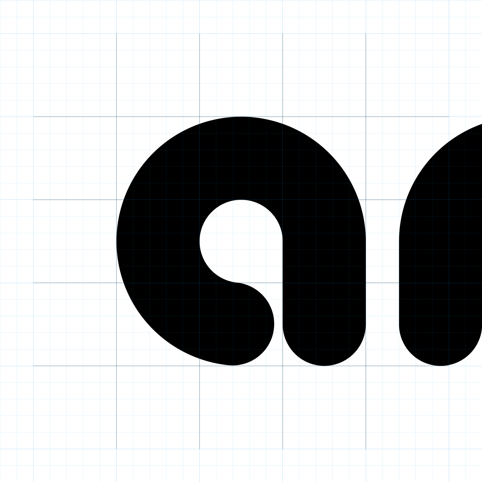
With that 3×3 grid per letter, I simplified each letter in the word analog as much as possible, while keeping the thickness of the lines to at least one full grid step. This is the result of that process:
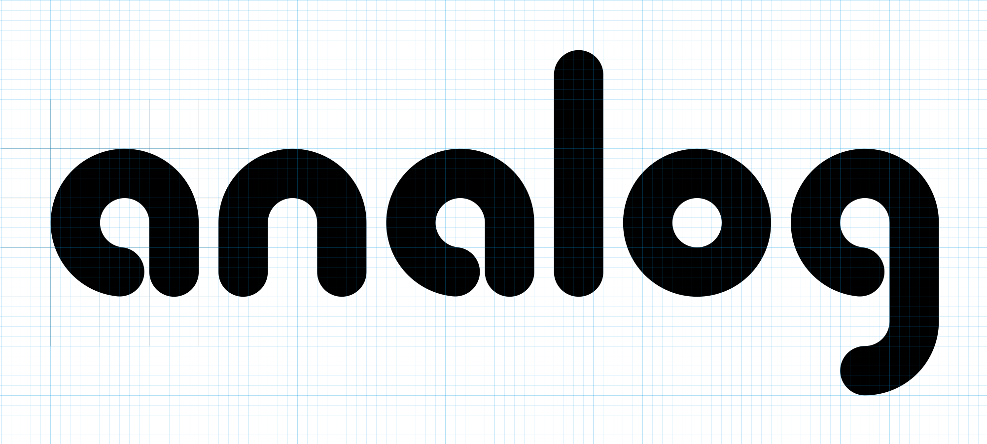
Ok, this looked kind of interesting. It feels both retro and contemporary, and has a nice clean style. I’ll keep this idea for the text version of the logo.
For the logotype itself (by that I mean the symbol), I took the ‘a’ from above and scaled it up. The shape is really nice, but it’s a bit too simplistic on its own. So how can I make it more interesting? I’ve always liked logos built up of collinear bands, like the Warner Bros logotype from 1971:
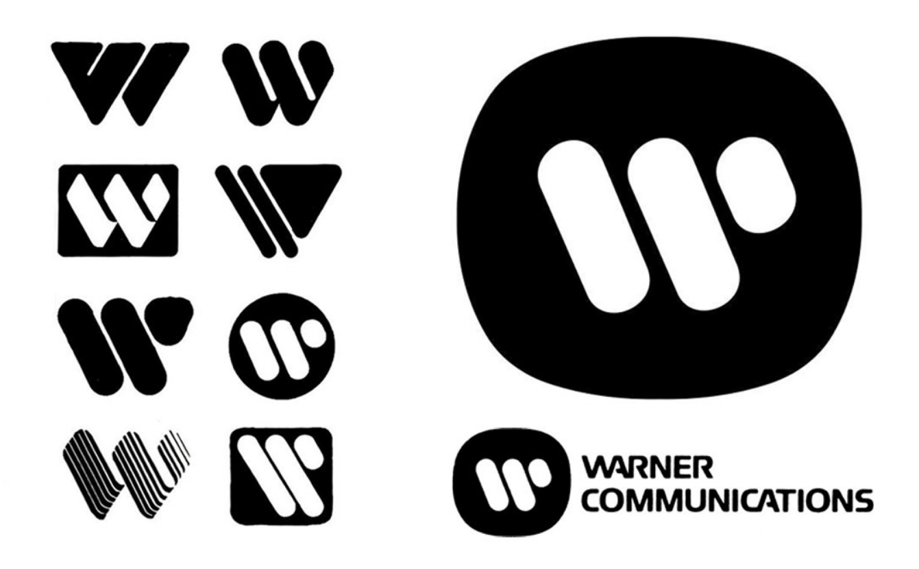
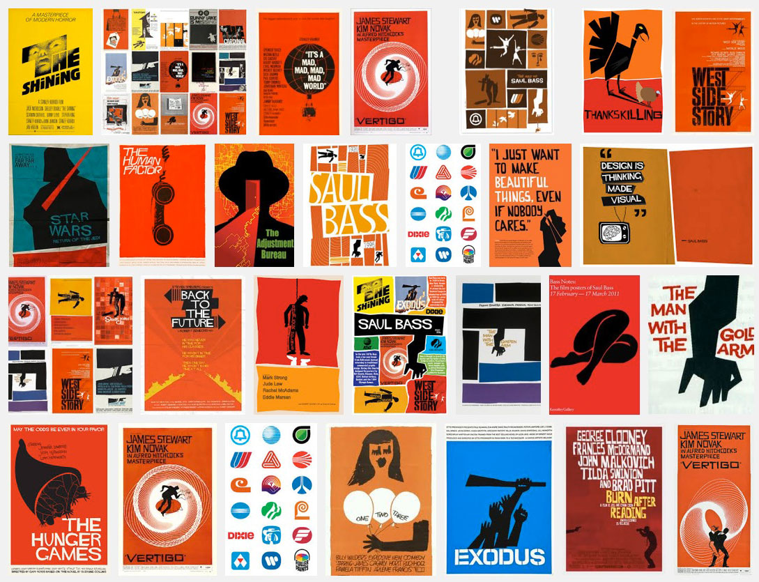
It was designed by legendary graphic designer Saul Bass, who also created a number of well known movie posters and other company logos:
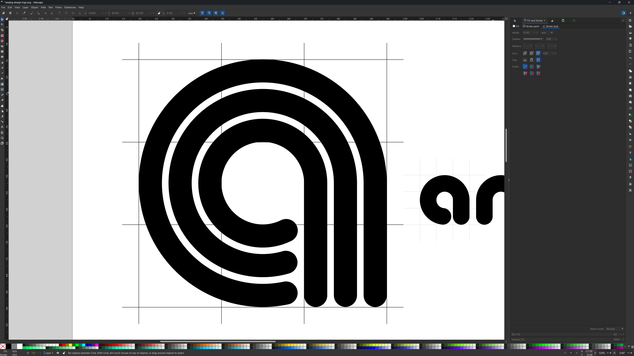
Anyway, applying a banded style with three collinear bands to the letter ‘a’ from above gave me this:
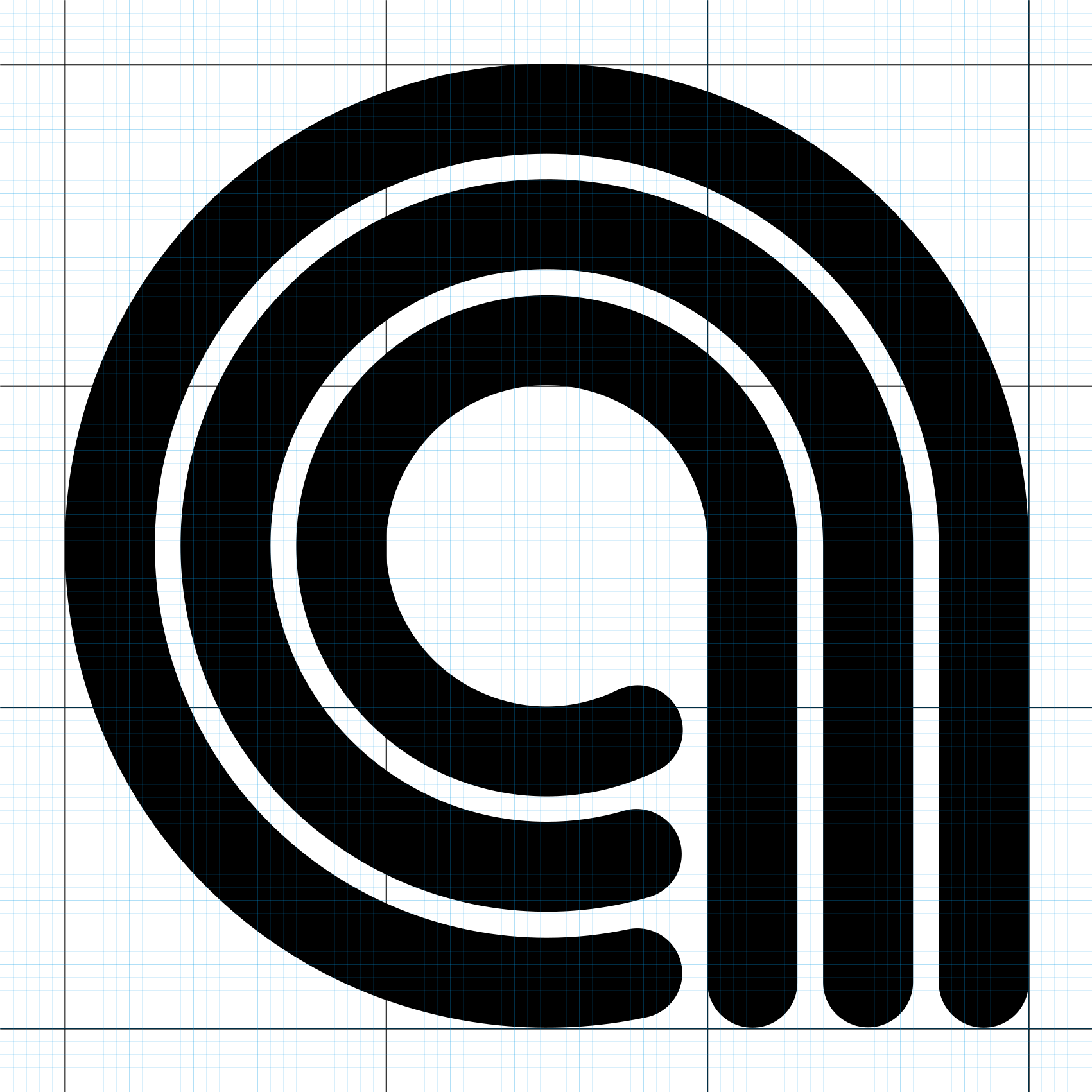
This logo feels modern and a bit retro to me. It’s clean but still recognizable (I hope it doesn’t already exist :-)). So I’ll stick with this one for now!
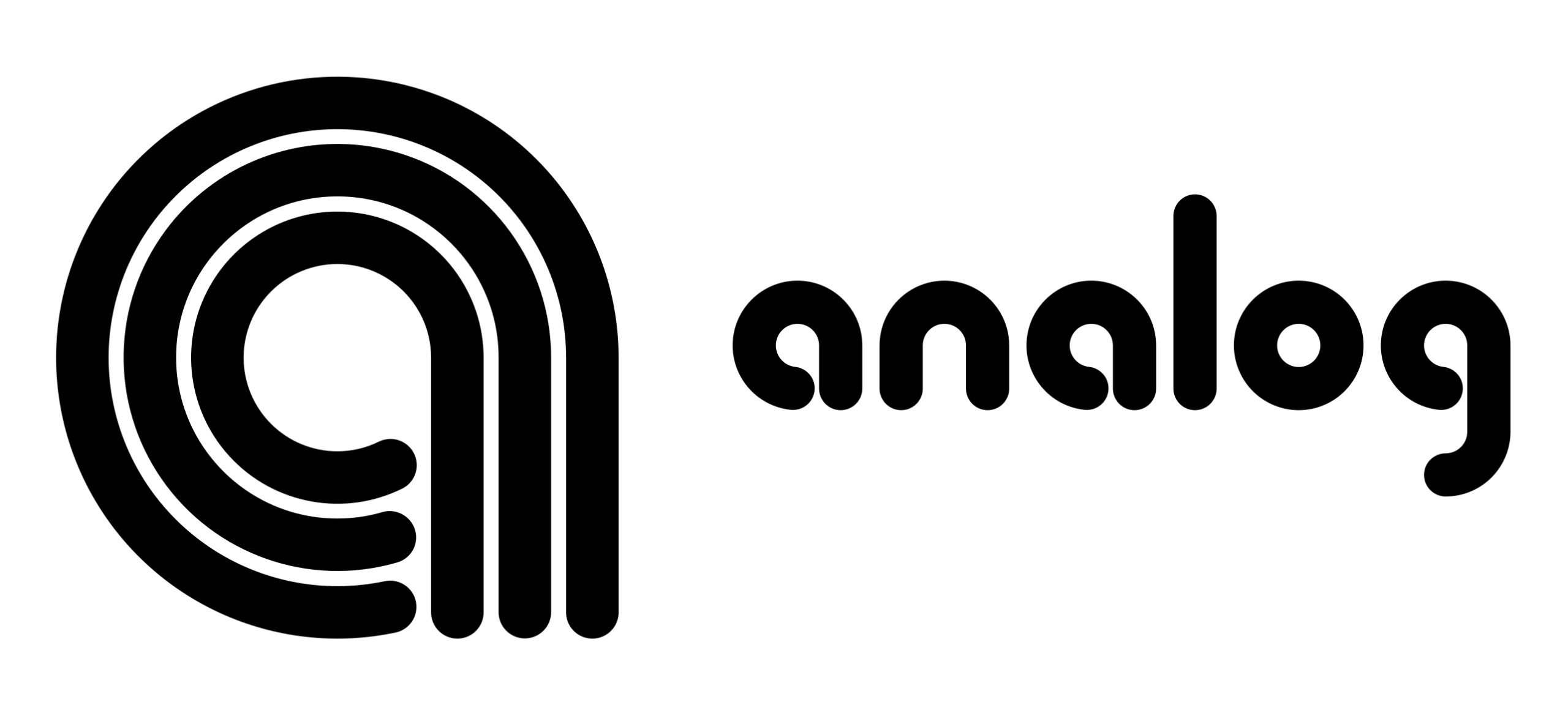
Removing the grid and zooming out a bit, this is the final version:
Leave a Reply